R'Y'M - music sharing responsive web
Project type: Native app design - Project based assignment (Google UX Design Professional Certificate)
Date: July - August 2023
Location: Bucharest
Role: UX Generalist: UX Designer, UX Researcher, UX Interaction Designer, UX Writer
Design Process
The problem
Various types of artists (pro’s or semi-pro’s) are trying to promote their music and to generate interest for it. Even if they are not fully involved musicians, they look for recognition and awareness for their creative work.
The goal
Design a sharing music (rock) web responsive platform to support musicians - at the beginning of their road or with some experience in the field - to disseminate their songs among larger audience or selected niche one.
My responsibilities
-
Discovery: define problem, persona, user journey
-
UX research: identifying user insights for defining a relevant user journey
-
UX Design: paper wireframes design and low fidelity mockups for responsive web design
-
UI Design: Lo-Fi prototype (web, tablet, mobile - Adobe XD) + Hi-Fi prototype (web & mobile - Figma)
Following the first step - designing a native app - for the same purpose, I continued with designing for the same cause, but for a different persona a responsive web design in a graceful degradation manner: web, tablet, smart phone.
Let me show how I have approached this design engagement .
Persona

Affinity map

After the fist round of user interviews, I depicted the user journey. Subsequently, in order to easy the website navigation, I envisaged a comprehensive sitemap covering all potential features. I aimed to clarify as early as possible the IA outlook that would eventually be reflected in a smooth, effective navigation. My objectives:
-
Simplicity
-
Appeal
-
Clarity
User journey

Site map

Paper-based and digital wireframes (Adobe XD)


Paper & digital (Adobe XD) screen size variation wireframe , grateful degradation


Low fidelity prototype versions
Following the feedback of the users the first version of lo-fi prototype, I came with several improvements
-
emphasised more the Similarity, Proximity, Common Region, and Focal Point Gestalt principles
-
add more cues
-
streamed the layout
-
move to fixed vertical menu.


Transition from wireframes to hi-fi mockups + hi-fi prototype
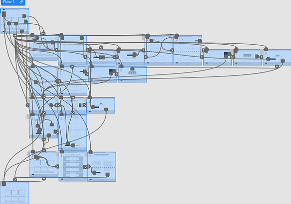
I continued with the design of mockups for web, while striving to maintain consistency with the envisaged IA. In this stage I aimed both on the appeal/ aesthetics of the site, but also on emphasizing more the focus in pages to help users identify the primary task along the journey, in line with the usability study insights.

For a comprehensive view of the proposed design, I have also rendered the site in mobile version in a responsive manner:
-
Reshaping the header and the footer to fit the screen
-
Creating a hamburger menu to concentrate the menu in it
-
Adjusting the size of text and images
-
Rearranging the layout to fit the mobile size


Accessibility considerations
I applied the following accessibility features:
-
I used headings with different sized text and fonts for clear visual hierarchy and I also used landmarks to help users navigate the site and the mobile responsive version, including users who rely on assistive technologies.
-
Like in the previous Figma design, for potential users who might have vision imparity, I used larger and caps text as well as supportive, complementary messages. Also, I used strong contrasts for a clear visibility of CTAs.
-
I used “play” buttons for the songs enlisted (new or old) to enable customers have a smooth experience - in the potential execution of the app, there will be only 15-20 seconds from a song.
Lessons & takeaways
After this web responsive second design exercise, I realised how effective practicing design scenarios and running user validation sessions can be for the end state experience and the planning for the next steps. Equally, experiencing the design with a different tool - Adobe XD - helped me to craft prototypes in a more efficient and versatile manner.
