

R'Y'M - music sharing native iOS app
Project type: Native app design - Project based assignment (Google UX Design Professional Certificate)
Date: April-June 2023
Location: Bucharest
Role: UX Generalist: UX Designer, UX Researcher, UX Interaction Designer, UX Writer
Design Process
The problem
Various types of artists (pro’s or semi-pro’s) are trying to promote their music and to generate interest for it. Even if they are not fully involved musicians, they look for recognition and awareness for their creative work.
The goal
Design a sharing music (rock) web responsive platform to support musicians - at the beginning of their road or with some experience in the field - to disseminate their songs among larger audience or selected niche one.
My responsibilities
-
Discovery: define problem, persona, user journey
-
UX research: identifying user insights for defining a relevant user journey
-
UX Design: paper wireframes design and low fidelity mockups
-
UI Design: Lo-Fi prototype + 2 versions Hi-Fi prototype
I invested a lot of time in discovery and ideation - almost 4 weeks in order to come up with the right user profiles, user flow, and expectations and to properly understand the various contexts those users were acting.
For the App version of R'Y'M (Rock Your Music) I have initially identified 3 personas. However, for the design projects I have chosen two different ones: one for the native iOS app (depicted below), and one for the responsive design version of R'Y'M (see the project description in the Portfolio section).
Let me show how I have approached the design process for the native iOS app.
Persona
"Music is important, but the vibe in the concert hall and the beer after counts, too."

Ideate with storyboards


Affinity map


After initial ideation exercise and fist round of discovery interview, I started the user flow design as well as the user journey.
Eventually I started the very design following the whole path: paper-based wireframes, digital wireframes, high fidelity mockups.
User flow & User journey


Paper-based and digital wireframes (Figma)


During the second user validation iteration (run both assisted and unassisted) on low fidelity prototype, I acknowledged new user expectations and potential frictions, which I strived to reflect in the design of the high fidelity mock-ups and prototype.
Low fidelity prototype versions (including users feedback)
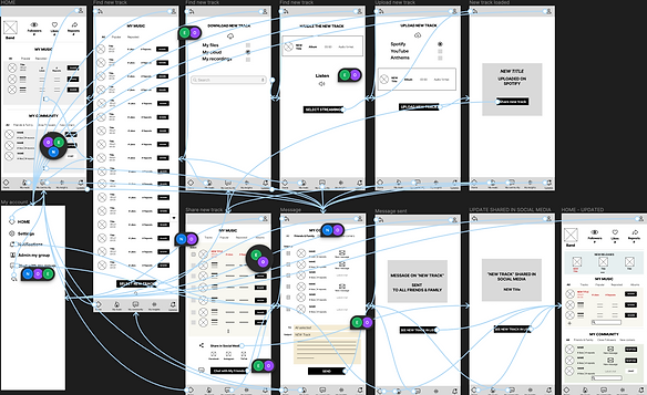

Transition from wireframes to hi-fi mockups + hi-fi prototype


UX Research synthesis
Along the project I conducted 3 rounds of usability studies: paper WF; low-fidelity prototype; high fidelity prototype. Each round was a good opportunity to reconsider my initial design and to find new ways to reflect the diversity of the user expectations. The design has gradually evolve thanks to these rounds of feedback and help me simplify the design and look for key aspect of the journey and navigation to emphasize core values in the final version.
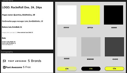
Accessibility considerations
I applied the following accessibility features:
-
For potential users who might have vision imparity, I used larger and caps text as well as supportive, complementary messages. Also, I used strong contrasts for a clear visibility of CTAs.
-
Also for enhanced usability, I inserted icons to help make navigation easier - using well recognizable icons for an easy acknowledgment
-
I used “play” buttons for the songs enlisted (new or old) to enable customers have a smooth experience - in the potential execution of the app, there will be only 15-20 seconds from the son with the most representative sequence of those songs.
Lessons & takeaways
Design is a continuous journey. It is a mind growth enabler and a leverage for creativity.
Testing with user is also great: “a-ha” moments and confirmation of the solutions you are proposing are priceless!